
I’ve ranked just about every possible Bowie-related thing under the sun, so when I went back through my previous lists I was astounded to find there was a glaring omission – I haven’t done the album covers yet! Can you believe that?!?
Well, I’d better crack on with it then before I get labelled as a fake fan.
Just some clarification before we begin – I’ll be ranking the album covers purely on their merit alone, regardless of the musical quality of the album itself. Also, my sub-headings like “Meh”, “Good” etc. are all relative to the standard that Bowie set, as to be honest most of his album covers are pretty iconic.
Alright, with all that out of the way – how would I rank all of Bowie’s 26 studio album covers? Oh, and you can check out some of my related lists below:
Bad
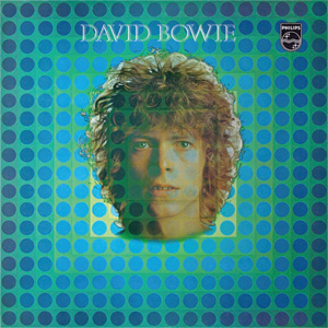
26 – David Bowie (1967)

I’m sure Bowie must have looked back on this album and laughed – the music itself is awful as well, but the cover is just ridiculous even by 60’s standards.
Bowie looks so uncomfortable and out of his element, like he had no idea how to pose during this photo shoot.
25 – Reality

I’ll forgive Bowie for his 1967 debut cover art. He was just starting out, and I’m sure he had no idea what he was doing – but this monstrosity is inexcusable.
There are some decently cool bits of imagery around the Bowie figure on “Reality”, but the actual Bowie cartoon itself is just ridiculous. Just look at his face! Those massive eyes! I have no idea what he was thinking, and this is the only true stinker as far as his official album covers are concerned.
Meh
24 – Buddha of Suburbia

A.K.A The one where Bowie just sits on a bed, looking off into the distance as if that was going to make the album cover more interesting.
Granted, this was just a TV soundtrack so it didn’t need to be anything extravagant, but it is an official Bowie album so I’ll have to lump it in with the rest.
23 – Black Tie White Noise

This is certainly … a face.
There have been a few album covers in Bowie’s career that have just been profiles. At least this doesn’t look as uncomfortable as his 1967 debut, but this is still the least interesting of the lot.
22 – Space Oddity
“Space Oddity” actually has some pretty neat effects going on around Bowie’s head, and it really adds to the space themes.
That being said … could it have been more spacey? I’m clearly not one to talk, but considering all the grandiose ideas of space and various instrumentations that reflect the larger scale this time around, you’d think they’d splash out on a more interesting cover art, no?
Also, points deducted for the ridiculous hairstyle.
21 – The Next Day

On the surface of it, this album cover may seem lazy – but it’s actually quite a clever metaphor for the album, how Bowie was going to sacrilegiously overwrite the past in order to carve a new musical future.
Cool metaphor aside, it’s a bit boring innit? Like, it’s just a white box over the “Heroes” album, I can’t help but compare the two and think the original is (obviously) way better.
20 – Pin Ups

An unbelievably boring album, so it’s only apt that Bowie chose a similarly lacklustre album cover.
It has a little more flair than the regular profiles (there’s someone else in it this time, what fun!) but it’s a simple profile nonetheless.
OK
19 – Hunky Dory

I feel terrible ranking “Hunky Dory” so low – it’s an iconic album with an iconic image, so why have I ranked it among some of Bowie’s worst?
Well, it’s just a simple profile really at the end of the day. It’s got quite a cool painting effect that elevates it slightly, but that’s as much as I can say for it.
18 – The Man Who Sold The World

I actually really like what Bowie was going for with this one, that whole aspect of gender-bending and pushing the norms is what made him such a legend even in the early stages of his career, and this was the first time we really saw that.
Unfortunately, it’s the bland colour palette that lets this one down. Whilst there is some cool imagery on display, that dull filter on the top of it makes it hard to look at, and it certainly doesn’t stick out at all in his discography.
17 – Never Let Me Down

Bad album, decently colourful and fun album cover.
Not sure about the outfit and hair that Bowie is rocking, but the circus-themed set that he inhabits is admittedly quite eye-catching.
16 – Tonight

Maybe I’m just a basic, dumb-brained, average consumer that doesn’t understand the true implications of artistry, but I like the pretty colours here.
It’s not exactly a cohesive album cover that tells a story, and the blue effect on Bowie is a little off-putting, but it’s appealing to the eyes.
15 – Young Americans

At its core it’s just another Bowie profile, but this one is far cooler and more chic than the others.
There’s a certain sex appeal, almost as if Bowie is fully embracing his foxy side and pushing that to sell more records (hey, if it works, it works). That beautiful ginger hair, the lit cigarette – it’s unlike any other look that Bowie went for, but that’s what makes it stand out.
Good
14 – Station to Station
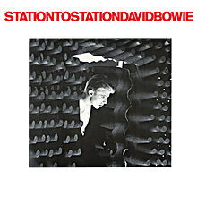
As much as I absolutely bloody adore this album … the cover art is only a simple black and white photo when it boils down to it.
That being said, it’s quite a mysterious and intriguing photo. Taken from the set of “The Man Who Fell To Earth”, there’s an unnatural aura in the air of this one that makes you want to find out more.
13 – Blackstar
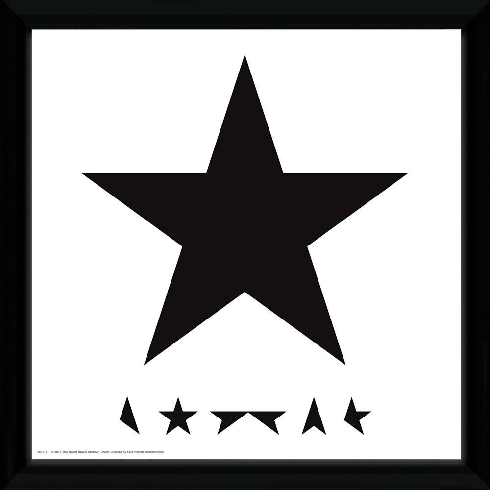
This one is in a similar boat to “Station to Station”, as at the end of the day it is just a simple photo of a black star after all.
Similarly to that other album, though, there’s that sense of wanting to know more. The huge, black star is almost arrogant in the way it takes up the whole cover, and coupled with the themes of death on the record itself it actually works really well.
12 – Hours…
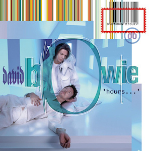
Ignoring the quality of the album itself, this artwork is actually pretty cool.
It’s a little schlocky and cliché by 90s standards, but that image of two different Bowies interacting with each other is quite a memorable one. It’s almost as if the new “Hours…” Bowie is comforting a dying “Earthling” Bowie, which is quite symbolic.
11 – Heathen
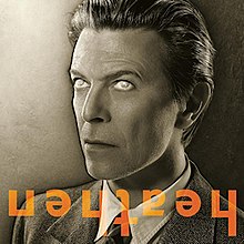
Blimey, how ominous is this?
The freaky eyes, the upside-down album title … it all gives off some seriously unsettling vibes, which perfectly sets up the tone of “Heathen” before you even listen to it.
10 – Earthling

There’s something so 90’s about this album cover, from the Windows Vista background to the ridiculous outfit worn by the man himself.
I’m a sucker for a colourful album cover, and “Earthling” is practically a colour assault with Bowie’s multi-coloured coat. He’s also facing away from us, which adds another aspect of mystery.
9 – 1.Outside

On the surface, this seems like such an average Bowie album cover – and you’d probably be right if I was being honest with myself.
I don’t know what it is that draws me to “1.Outside” so much, I guess there’s just something about that emotionless figure of a man recklessly painted with aggressive swipes that fits the album down to a tee.
8 – Lodger
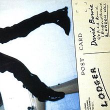
Sometimes reading half a story is just as interesting as the full experience, and the reader is left with an infinite number of possibilities for where the narrative could go.
“Lodger” has that exact appeal, and whilst there is an actual resolution to this story (the back of the album has the other half of Bowie with a broken nose, quite funny actually) I just really like how we only get a tease of the great man.
Great
7 – Low

Another picture taken from the set of “The Man Who Fell To Earth”, but I think the colour contrast of orange and black works a lot better than the monotone colours of “Station to Station”.
The other thing that makes this album cover a personal favourite is that aforementioned use of orange. It’s my favourite colour, what more can I say?
6 – Let’s Dance

Bowie’s best-selling record was always going to need a flashy piece of cover-art to go along with it, and “Let’s Dance” knocks it out of the park for me.
The vibrant use of orange is always welcome, and the imagery of boxer Bowie towering over a picture of a city landscape has been etched into my memory.
5 – “Heroes”

It surprised me while doing this list just how many black and white covers Bowie has in his discography, but what’s possibly even more surprising is how much better “Heroes” is then those others.
“Heroes” has a losing combination before you even take the time to look at it – it’s a standard profile, and it’s devoid of colour. That being said, his pose is iconic, and the lack of colour has never been more suitable for a Bowie record with all the harsh sounds and Berlin-esque soundscapes.
Amazing
4 – Scary Monsters (And Super Creeps)
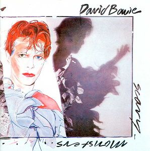
This album art is just really clever on the whole.
The cool sketch of Bowie and his peculiar shadow are the main players, but when you realise that the concept sketch has been brazenly pasted over the real-life Bowie so that there’s nothing left but a lifeless drawing and a dark shadow, you start to truly understand the genius of it.
3 – Diamond Dogs

Of all the hand-drawn covers in the Bowie discography, “Diamond Dogs” is by far the most detailed with it’s fantastic colour spectrum and focus on lore / world-building.
Being a concept album, and quite a masterful one at that, I suppose you’d expect nothing less than a cover art that portrays the world that Bowie is describing in his lyrics – but his lyrics are so vivid and specific that it must have been easy for the artist to convey such a dystopian world. This is one of those album covers that feels like it belongs in an art gallery.
All-Time Great
2 – The Rise and Fall of Ziggy Stardust and The Spiders From Mars
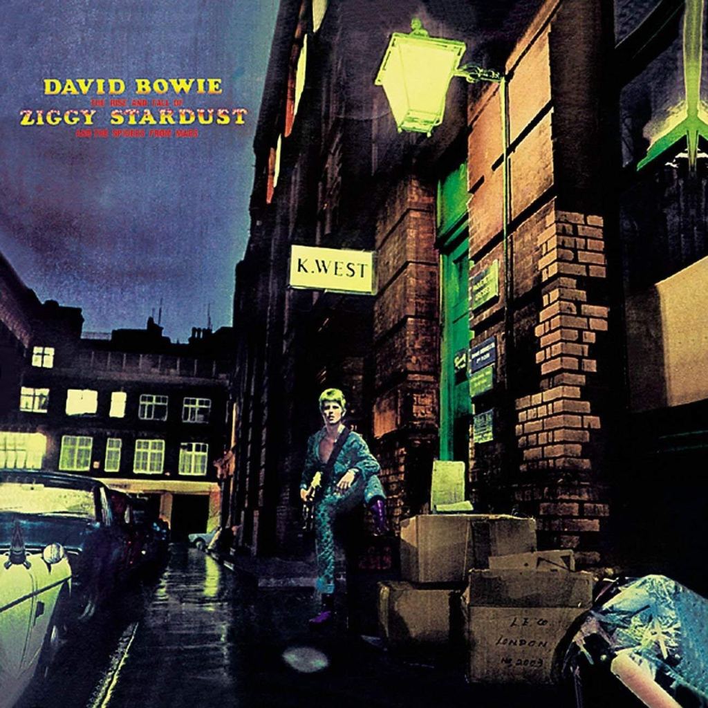
I had a hard time separating the actual contents of this album from the cover (as they are so intrinsically linked), but when you look at them both objectively you realise that both the music and artwork are masterpieces.
The “Ziggy Stardust” persona has become more than iconic over the years, and whenever his name pops up you’re bound to recall this fantastic art-piece. It’s quite incredible that it didn’t nab the top spot, but I feel there is one other album of Bowie’s that’s even more memorable.
1 – Aladdin Sane
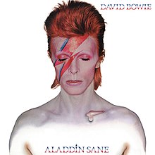
What could have just been another simple profile album cover ended up being so iconic that it outshone the album itself, and transcended the music iconography into pop culture legend forever.
This is the image that most Bowie and non-Bowie fans alike default to at the thought of the great man, and for good reason. The red-dyed hair, the pale white skin, the lightning bolt on his face … you can’t help but be intrigued by it, and I can imagine it sold a lot of albums just from the cover alone. In the pantheon of fantastic Bowie album covers, “Aladdin Sane” reigns supreme.
Aaaaand that’s my list. You can check out my latest blog posts below:
Things In “Clair Obscur: Expedition 33” I Didn’t Like
Ever since “Clair Obscur: Expedition 33” came out, I’ve done nothing but sing its praises on my blog. Followers of mine may even be fed up of the endless glazing – I’m a superfan and this is no doubt one of my favourite games of all time. It’s not all sunshine and roses, however. This…
Top 10 Albums of the 2020’s (So Far)
I’ve recently been going through every year in music for my thorough retrospectives, and as such I’ve been exposed to some fantastic albums. I wanted to talk about some of my favourites – this time looking at the 2020’s (or the first half of it, anyway!). I reviewed thirty albums as part of this decade’s…
Every “Mistborn” Book Ranked
I used to read a lot as a kid, but I stopped reading as a teenager for reasons I can’t quite explain. Either I thought it was uncool or it was a “waste of time”, I’m not sure. That all changed, however, when I bought myself a copy of Brandon Sanderson’s “Mistborn” … and the…

2 thoughts on “David Bowie – Every Album Cover Ranked”